

 Deutsch
 Português
 Korean
 Indonesian
Unveiling of Jubilee Logo
February 26, 2024
![]()
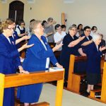
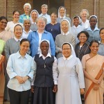
On the feast of the Mother of God, in Our Lady of the Visitation Province, Bangalore, the Sisters began celebrating their Platinum Jubilee, a legacy lived for the past 75 years. After the Holy Mass, a good representation of Sisters from the Assumption and Visitation provinces gathered around the Coesfeld Crucifix. We sang St. Julie’s song, after which Sr. Mary Chetana unveiled the new logo and briefly explained it. She appreciated every community’s contribution to the design of the logo.
Explanation of the Jubilee logo:
1. The shape of 75 signifies embracing all the joys and challenges over the years, as we move on with hope and gratitude.
2. The circle is the symbol of dedicated and selfless service of the Assumption and Visitation Provinces, signifying the missionary journey and the growth of the past 75 years.
3. The tri-colored map of India represents the vibrancy as well as the ancient grace and wisdom of our Motherland, which absorbs everything good and noble.
4. The flame in the heart of India challenges us to move forward to new areas with missionary zeal for the growth and development of the marginalized. We embrace the signs of the times with imaginative hope.
5. The sunflower seeks the sun’s rays, so we seek the Son to guide our onward journey, just as Mother Julie did in her time. The daisies represent the humility, simplicity, and charity of our foundress, Sister Maria Aloysia, and our co-foundress, Sister Maria Ignatia. The six green leaves represent our six pioneers, who remain ever fresh and green in our collective consciousness.
We invite you to join us in this celebration of gratitude and to pray for God’s blessings on our mission in India.

Recent Posts

Celebration of Jubilees in Kloster Annenthal, Coesfeld

Notre Dame Social Action: Health Care Prevention and Improvement

School Pastoral Ministry and the Easter Experience

Perpetual Profession in the Mission of Mozambique

Notre Dame RPP Center that makes God known in a unique way
![[JPIC News] The power of small step](https://www.snd1.org/wp-content/uploads/20240219-The-power-of-small-steps-Fimage-60x60.jpg)
[JPIC News] The power of small step

Student Council

For diversity in society: demonstration in Coesfeld